this week on the homepage, we've featured some of our employees' favorites. while we were narrowing them down, our email team started talking about their favorite covers. it was quite a heated debate! beauty & fashion are so subjective - everyone likes or hates things for different reasons. we want to know - which is YOUR favorite and why?


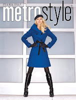
there's a tie in our building for the gold top & the blue coat!
24 comments:
Gold!!!
I love royal blue, the cover is winter and that's what I'm looking for, Winter Looks
The blue coat cover is well-balanced. It stands out and is more colorful as well. Also, the girl look more European and more of a fashionista without effort. The others look a bit phoney and as if they're trying too hard to look good.
I liked both the gold and the blue... godl wins for me because I loved the shine and sparkle and makes me feel like it's holiday fun time!
That color blue with black is always stunning and the boots and pose make it sexy!
I love the gold top cover....it's looks festive and she looks good wearing it....It shows that the Holidays are coming.
I've always liked bright color in my wardrobe so the model in the blue coat wins for me hands down!
I love that royal blue coat with the black accessories - It is very eye catching and it fits the season!!!!
Debbee - Chicago
I am into coats and boots. That royal blue coat and boot stands out-I love that look!!!!
The blue coat is both subtly sexy and overtly fashionable; the other two look like the cover for a men's magazine. Save those looks for inside
The girl in grey is definately out.. something about her looks totally unnatural. The gold top is cool, but the girls hair seems to be trying to steal the show. The blue coat looks great, not overpowered by the model, and seems like a look anyone could pull off.
i liked both color the gold and the grey
I voted for Danielle in the gold top however, I adore the royal blue cover also!
I think that using a signature face from America's Next Top Model is always going to help your sales!!
By the way, can we see Jaslene, Saliesha, and what about Whitney? I think if you put a full figured beauty like Whitney from top model, that will inspire many plus size women and bolster your sales!!!
Toni
Richmond,VA
I like the Blue coat cover because it shows fashion from head to toe. The entire look is so cool, hat, boots, great.
If this is based on the product, I'd understand that the blue coat would win. It is going to be winter after all, and people buy coats during this season. If I were to vote base on visual presentation, I personally like Cover A with the logo on its side. Most logos are either at the top or bottom. Being in a different area catches my eye and I actually read what it says. The model is pretty, though her pose seems a bit forced. But I mainly like it for its subtlety (though because I'm not seeing any promos or marketing messages on the cover, that could change).
I luv, luv, luv shimmer!!
The blue coat profile would flatter any woman of any size.
The other items demand a perfect body - which is fine if Metrostyle just wants their marketing focused toward one, small, subset of all woman.
I think if a company, especially a clothing company wants the respect for the product they are offering, all of their advertising and presentation should be of a respectful nature; it should always have class - so that customers/potential customers will value them more. If a clothing company presents itself as being intelligent, having quality in their product, a real concern for the different shapes and heights of women, and competitive and confident edge on current fashion - it will easily bring about the trust and interest they are looking for. If all a women's clothing company promotes is how to look sexy or like a fancy slut, they end up insulting their customers, and end up with a lot of one time buyers rather than repeat business. The cover with the woman in the blue coat, albeit a bit typical, is the best shot Metrostyle has at keeping their customers trust, attention, and respect.
I really think it had more to do with the bold color blue right in the center of the picture,which caused your eye to directly focus on the coat then on to the outside areas, the other two covers' colors seemed to be the same shade of neutral and your eye just wandered around on the cover, nothing really caught my eye like the blue coat did on the cover I selected as my favorite.
Hi, my name is Nan
I am a fairly new customer truly enjoy everything I have ordered!
You will always have my vote because of your fabulous style! Products are affordable for the average women of today. Last but not least, customer service are most congenial, truly knowledgeable about your line of clothes, giving you valuable advice when ordering for the first time.
The cover I voted was C (MS4000te)with the blue coat. To my eye A and C are the same woman. The dress shown as A with all the graffic design was similiar to one shown on Project Runway on TV. The reason I selected C was the colors, they really caught one's eye. Color like music does capture one, holds one's interest leaves a lasting impression!
You offer various styles so a women can choose her look for the day wether it be glamous or perky and reflect what she feels inside.
A satisfied customer.
Lovely
I love the royal blue, and that stylish coat; great fall look,and warm, very impressive, metrostyle also have great product and affordable price, I love them.
Happy Customer!
The blue coat rocks! Ordered some pants for my Daughter, not she's hooked on metrostyle, but for me, I hate paying shipping and handling charges, sigh. Kitty D., Pgh., PA
Dani in the Gold is just GORGEOUS!
I Love the gold look. Everything Dani models look great. She is a super top model.
Post a Comment
Hello! We value your opinion and encourage you to share your thoughts & feedback on the content on this blog. However we ask that you refrain from using any objectionable language such as profanity in your comments. Inappropriate comments will be deleted.